Monday, January 29, 2018

Last of Pre-Production

This week I started my final stages of Pre-production. I focused on the lighting, camera angles, artistic principles of design, and the look I want to convey with this piece.  I decided to take a different approach to my sketchbook page and actually make it in my sketchbook. Above is a screenshot I captured from a youtube video interview and then took into Photoshop to point out how the different lights were affecting the subject. The right backlight adds light to the subjects left shoulder, neck and back of the head. The top light is at an angle so it lights up the back of the right shoulder, and the top of the hair, making a shadow with the bangs of the subject. The last light I think they used was a fill light that was low and pointed up from the viewers right side but the subjects left. I can tell because the face is softly illuminated which indicates a less harsh fill light. Also there is a shadow above the subjects left eye (reversed for viewer) that makes me believe the light is lower and pointed up. 
Below are my sketchbook pages in which I took the ideas I found throughout the week and combined them by drawing each camera set up and perspective out on a different page. Each page has three illustrations. 1, top left, is where the lights will be put based off of this specific camera angle as if I'm in the room and l am seeing the whole picture and not just what the camera sees. The second, bottom left, which shows a black box and inside is what I want the camera to actually capture, cropping out the set design and everything I don't want seen in the film. The third, bottom right, is of a birds eye view using symbols to represent the set camera, subject, lights, etc. each of these drawings is different because the camera that is being drawn and written about on each specific page is circled in blue pen accordingly. Along with the drawings I have written a few notes on the principle of design being used in the shot and other important things that translate to the illustrations. I am not quite sure about camera 3 yet. I was basing some of this from the knowledge off of what we learned last year with multicam editing. However, we did a two person conversation and the use of the right and left cameras were to get the same shot of the different subjects. But I am only using 1 subject and as I watch more interviews I am starting to realize that my 3rd camera angle should still be a zoomed out shot but maybe keep in on the right side with the rest of the camera to not disrupt the flow and switch up the views. I have not decided what I will do and this is probably the last decision I will make before actually filming my interview with Jack.


Worklog:
Monday: Presentations and notes
Tuesday: Presentation and notes
Wednesday: Presentation and notes
Thursday: researched lighting positions for multicam interviews
Friday: Started to plan out camera angles, lights, camera positions, and creative aspects of the interview.

Sunday, January 21, 2018

MP2 Presentation Summaries #1

MP2 Presentation Summaries #1


Ariel:
Ariel is working with photoshop to recreate photographs into digital paintings. She uses layers to switch on and off from photograph to painting in order to get the most accurate representation possible without actually copying it. She even switches over and uses the color dropper tool in order to get correct skin tone colors which helps make the process easier since skin is particularly hard to represent. I especially liked an idea Mr. Bomboy brought up after her presentation about taking 12 screen shots every second to get a stop-motion kind of effect (12 fps is usually recommended) and do quicker recreations of these screen shots, lining them back up in Premiere, and playing to get an animated drawing type effect from an actual video. This is definitely something I would like to pursue, even if its not this year. I love drawing and the idea of movement so I can use these to make unique animations. I could also use this technique to make a customized animated logo since I enjoy creating production logos.

Brennan:
Brennan is actually doing stop motion with clay and it looks absolutely phenomenal. He's made a few short videos and I'm hoping he makes a longer one for the arts fest at the end of the year. Once again this plays into what I discussed above with creating a stop motion type of animation from drawings and screenshots. Everything from these two projects ties into what Mr. Bomboy talked about and everything that I would like to do in the future.

Tuesday, January 2, 2018

Job Investigation

Job Investigation


Recently I’ve been extremely curious about the jobs available in the film industry and which one’s interest me and fit what I am looking to do when I’m older. I'll be going to college in a few months so I thought it was important for me to get a general understanding of what is out there. Below are a few of the jobs with descriptions and whether or not I am interested in pursuing them.

 Director- This person is responsible for everything that goes on while on set. Film Directors are at the top of the Production Pyramid and all artistic details are run through him/her. The Director is in charge of translating the script into the film the producer envisions. Directors need to have an in-depth knowledge of the technical aspect of filming and the artistic things including acting, set design, and everything else. This job takes a while to be good at since so much knowledge is needed and some of that knowledge I’m just not that interested in. I feel that Directing could come later in my career but initially I would not like to pursue it since it is so challenging.

Producer- This person has the most important role money making wise. They are in charge of finding a script and turning it into a movie on time and on budget. Some Producers double as a Director as well so the exact job of a Producer varies. They are responsible for all the off-set logistics that goes into bringing a film to life. This is a career I would like to pursue because I am really good with logistics and being a leader. Not only would I be in charge of the movie but I would also be able to share my ideas about what I want without having to have every little piece of knowledge in how to make my ideas come to life.


Set Designer- These people are in charge of blueprinting and constructing every set in a movie. They take rough drawings from producers and Directors and make them into a reality. I am slightly interested in this job because I like to make things and am good at it too. Also, it’s a job that requires a lot of problem solving, so each day is different and I bet I’d rarely get bored. I feel like it would be a good way to start in the industry.


Director of Photography- Also known as the Cinematographer this person is the right hand of the Director and is entrusted in bringing together the ideas and coordinating different departments like lighting, sound, camera operations, and talent. This is another big job but could also be a good starter. I could go to school at Tennessee and study Cinematography which is one of the majors they required and hopefully go right into working. It would also give me a good background of knowledge if I ever want to become a director or Producer.


Movie Editor- After Productions is wrapped, this person works through every shot and tape and formats them into a flowing narrative. They work in teams so they can consult with one another in order to find the best final cut. I have a good background on using editing programs so I would like to pursue this career. I’m not the best at taking the shots and camera settings and that stuff so this would let me use my skills that I already have.


Work Log:
This week I tried to coordinate when Jack and I will be filming and I sketched out a few shots and ideas for what I want to create. I also started another project in After Effects to make an animated production logo to put in before my film.

Tuesday, December 19, 2017

Color Correction & Color Grading

Color Correction is the process of changing every clip in a sequence to get good exposure and good Neutralization is the process with in this process when a clips colors are neutralized and flattened to allow an editor to color grade footage with a clean slate, bringing out the colors and schemes they want to instead of working with what is already there. Temperature is adjusted by implementing more orange to even out a cold bluish clip or vise versa, the allowing the editor to come in an give it the temperature they want to convey in the shot. Instead of editing footage based on how it appears to the human eye, SCOPES help show the balance of colors and contrast and make correcting easier by leveling out such features.
light.

Color Grading is done after color correction and is the creative process of adding and manipulating colors, lighting, and exposure again, but in this case instead of flattening and neutralizing, color themes, schemas, gradients, and more are introduced and give the footage a specific feel. This is a purely creative process and grading varies from editor to editor, but there are certain looks that give video certain feels such as using orange tints to convey warmth; increasing contrast to show suspense; adjusting lighting during a different type of day; and countless other possibilities.


Order of Operations:

1. Remove artifacts and de-noise.

2. Balance your shots by adjusting BLACKS/MIDS/WHITES, SATURATION and WHITE BALANCE.

3. Relight within a shot using power windows or masks.

4. Add gradients, diffusion and other lens filters.

5. Add vignettes

6. Grade your images

7. Simulate a film stock of your choice

8. Resize and sharpen

Work Log:
I worked on animating and editing my outer space earth logo all week in Adobe Premiere Pro.

Monday, December 11, 2017

Moonrise Kingdom


Moonrise Kingdom Review

In 2012 I remember laying on my parents’ bedroom floor when they decided to watch a new movie that recently became available on onDemand. It was the first time I watched “Moonrise Kingdom” and artistic coming of age 
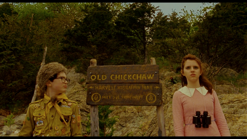
story about an orphan khaki scout named Sam Shakusky and borderline psychotic Suzy Bishop. The movie is directed by Wes Anderson who is most well-known for his distinctive visual and Narrative style, specifically his use of flat space camera moves, obsessively symmetrical compositions, knolling, snap-zooms, slow-motion walking shots, a deliberately limited color palette, and hand-made art direction often utilizing miniatures. This makes his works extremely intriguing to younger and old eyes because of its beautiful aesthetic. All these years later and “Moonrise Kingdom” still has a special place in the back of my head so I decided to rewatch it.

Due to their circumstances a twelve years old boy and a girl who fall in love with each other runaway from their homes. At the beginning of the movie 'Moonrise Kingdom' produced by Wes Anderson the viewer sees Suzy's home and a first impression of the relationships between the family members. After that you get to know about Sam's surrounding who lives in a scout camp right now. The camp master embodies discipline and strength. All children have to wake up to eat breakfast. In this moment they noticed that Sam is missing. He left a note in his tent which says he left the camp and he will never come back. The scouts start a posse to find Sam. Meanwhile captain Duffy Sharp who helps to find Sam contacts his previous foster parents. In this conversation the viewer catches a lot of information that Sam has emotional problems and is not longer welcome in the house of the foster parents. Sam and Suzy, got to know each other on a theater play, meet on a meadow to escape together to an unknown bay. On their adventure trip through the nature Sam takes care of Suzy that she does not hurt herself. They converge and begin to trust each other. In the meantime every scout khaki, the police as well as Suzy's parents are looking for the two adventurers. Thereby the relationship between Suzy's parents and their attitude towards their own daughter becomes obvious. When they are found by the scout khakis they defend themselves and manage to flee to their secret bay. Out there Sam and Suzy enjoy their togetherness and come closer. In the next morning the scout khakis find them again in their tent and they have to go back. Both become separated from each other. Sam is threaten by going into the orphanage and Suzy's mother reacts uncomprehending and prohibits any contact to Sam. Before Sam has to leave to an orphanage the other scout khakis start to think about his situation. Their result is that Sam is not so different from themselves and that everyone has blemishes. They resolve to help him to flee again. Together with Suzy Sam and the scout khakis flee to St. Jack Wood Island where Sam and Suzy get married. All children hold together. The situation gets out f control because everyone is looking for the troop. Plus, the long-awaited storm arrives. Sam and Suzy's last chance to escape is to jump from a building, but Duffy Sharp save them by telling that he adopts Sam. In the end the viewer can see Sam hanging around at Suzy's place. When his new adoptive father picks him up Sam says to Suzy: 'See you tomorrow!'.

There’s a lot of great performances from known actors in this. Bill Murray delivers a great performance as Walt, Suzy’s father. There’s a certain sadness to Walt that Murray really brings to the screen. The way he speaks, moves, and just the way he looks evokes a sense of disappointment. Murray also plays off co-star Frances McDormand (who’s also quite good in this) very well. Not to mention several of the film’s funniest bits come from Murray. Edward Norton delivers one of the best performances in my opinion. It’s hilarious seeing Norton play such a goofy character with so much conviction. Goofy as his character is though, there are points where you really sympathize with him, and eventually respect him. Bruce Willis is great as a lonely police captain, and actors Jason Schwartzman, Tilda Swinton, and Harvey Keitel all of very fun cameos.

What I didn’t expect to realize the second time around was the quality of performances from the child actors. Jared Gilman and Kara Hayward are both great as the lead protagonists. Both are very likable, and they have good chemistry together. You root for them to succeed throughout the film. I also like how the film didn’t avoid the darker sides to their characters. Likable though they may be, these are two seriously disturbed children, and the film never pretends that they’re not. The performances from the other children in the cub scouts are also solid.

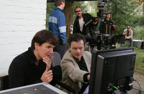
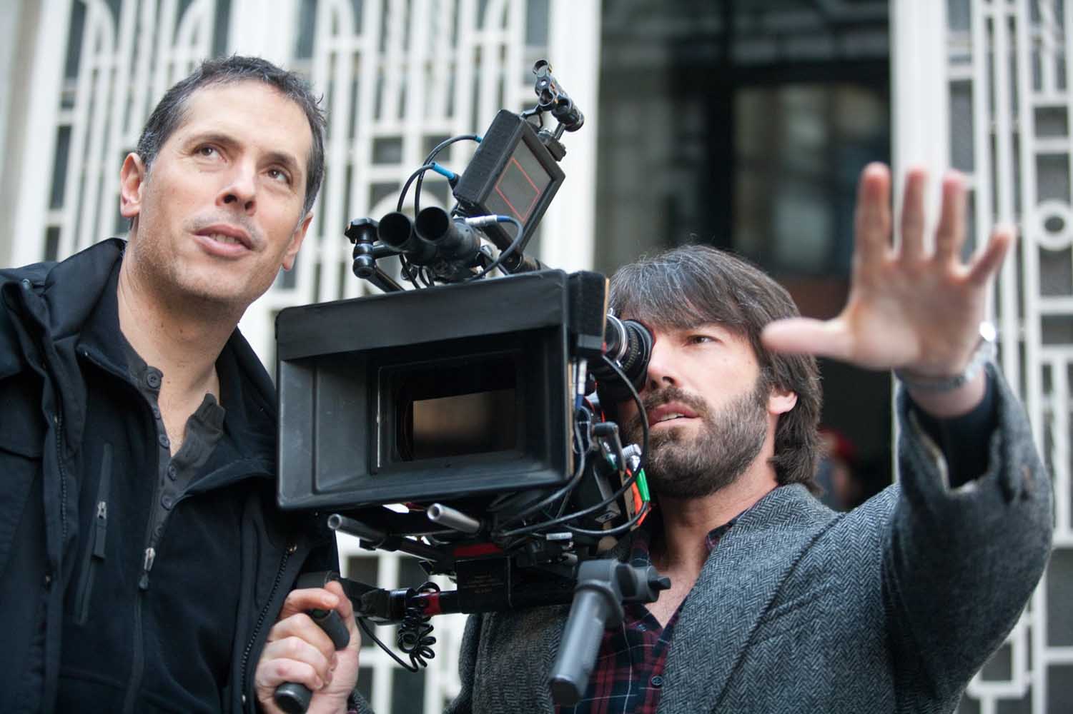
Stylistically, this film has a lot going for it. There are several impressive tracking shots, but almost every shot has something interesting about it. I also really like what Anderson and cinematographer Robert Yeoman did with the color scheme. Some scenes had an almost golden like shine to them, while the film’s climax had a really cool dark blue thing going on.

All in all I would rate this movie up there with my all time favorites. As a kid I enjoyed the movie because it was abstract and different but I never understood the true darkness behind all the humor until I rewatched it. The cast, script, soundtracks, and director made this film nearly flawless.

Work Log:
Monday- No School
Tuesday- researched and watched videos of how to set up and use a lavalier mic to its full potential. I also went around the school to get some B-roll footage in case I need more clips later in the project.
Wednesday- Mr. Bomboy taught me how to use the lavalier mic including setup and which cables to get and attach it to. Then I got my camera, sd card, mic and chords, and tripod and went to the studio and set up everything. Then I recorded myself talking with the mic on.
Thursday- I downloaded the footage I got yesterday and listened to the audio which was a little rough even with the mic. So, I worked on manipulating the audio and adding a few affects to get rid of background hum and audio grain.


Friday- Today I storyboarded what angles I will get of Jack when I shoot the interview and what shots I want to capture of him playing his music.

Sunday, November 19, 2017

Photoshop

Photoshop Investigation

I have never used photoshop before so this week was all new to me. It kind of reminded me of the old painting app on dell computers but was obviously more advanced and much less straight forward. I struggled for a few days as I felt my way through the program, eventually I turned to watching youtube videos in class and at home to further expand my understanding and give myself a background before I started this project. I've always found making logos to be one of my favorite things and I enjoyed learning a new way to make them on a new application.

My idea is completely original. I did watch numerous videos on how to create logos but I wanted to make something that I came up with, not just following the steps of another person's ideas. I did learn a lot about some common themes with digital logos, the first being a shape that encloses the text. This defines the area that you want viewers to look at and gives a kind of unity to the project. Rather than just having text, by adding a shape, the logo becomes more complex and professional. Secondly most of the logos had some kind of emblem, I wanted to make one but I found it extremely difficult to work with shapes in the unfamiliar program. I also noticed that some logos had one or two letters that were bigger than the rest and kind of acted as the logo. So instead of just frustrating myself with messing around with shapes I went online, found a really cool text that made the letter "A" look unique and i downloaded it into photoshop. The font made the letter so different that I used it as my emblem. I then attached the two D's to the "A" ad to each other. I had to make a bar out of i's in order to fill the gap at the top and connect the two D's. Then I added the "LIFE ON" part and thought I wanted to put in somewhere that connects it to the rest of the project. Understanding that people read from left to right I wanted to incorporate the words on the left side so people would read the logo as "LIFE ON ADD" instead of some other wording. I also did this in order to avoid any confusion in that respect.  So I put it in the letter A which brought the words together and into the piece while also keeping them to the left side.

I was relatively satisfied with the basis I ha created so far but I realized it looked flat and not really up to par with other works I looked at. So I added depth by duplicating the words and letters, placing them behind the previous layers, and changing the color to a dark blue/grey, my favorite color. It was starting to look better but I wasn't satisfied, I had this great gradient on my background but the text still didn't really look 3D so I did some research on how to make shadows. I do the idea of the eclipse shaped shadow by one of the logos that I looked at but I didn't know how to create it. My research failed in offering me a solution to my problem so I continued to mess around with the program. First I tried drawing out a thin eclipse and feathering it out but it didn't give me the effect i wanted. So naturally I asked my teacher and he showed me that by double clicking on a layer a panel shows up, in the panel it gives workers numerous options on how they can edit the appearance of a layer. One of the options was a drop shadow, so i applied it to my eclipse layer, dropped the show lower from the layer, moved my shape out of the screen so it wasn't in the frame, and finally feathered and smoothed out the shadow to what I desired.

Worklog
Monday: Today I started to fool around with photoshop but was frustrated because i couldn't find the tools I was looking for and didn't really know how to use them
Tuesday: I looked at youtube videos on how to create logos in Photoshop and started to become more familiar with the application.
Wednesday: I went back to messing around with photoshop and found it much easier to create something with my new knowledge. 
Thursday: I did some more research at home and started to draw out ideas that I wanted to make in Photoshop. However when I got to class i ditched everything I planned out and just had fun creating. By the end of the period I had the large "ADD" letters down and the "LIFE ON" part in the "A". I also made a background with a radial gradient.
Friday: I finished the Logo and am planning on animating it in illustrate next week. I added depth to the text, added the box, and put a gradient on the "A"