Color Correction and Grading
What is it?
Color correction is a step in the post production progress in which numerous effects including exposure, contrasts, and color levels, are adjusted in order to balance the footage's color and color of the light. This step widens the options of an editor has during the Color Grading step.
Color Grading is the next step when an editor alters and enhances numerous settings (like the ones above) with the intent to give an artistic presence to that particular clip. Each editor has its own style of color grading and different color grades can be specific to moods that the direct wants to be set in the film.
Color Grade Examples:
 "Orange and Teal Look"
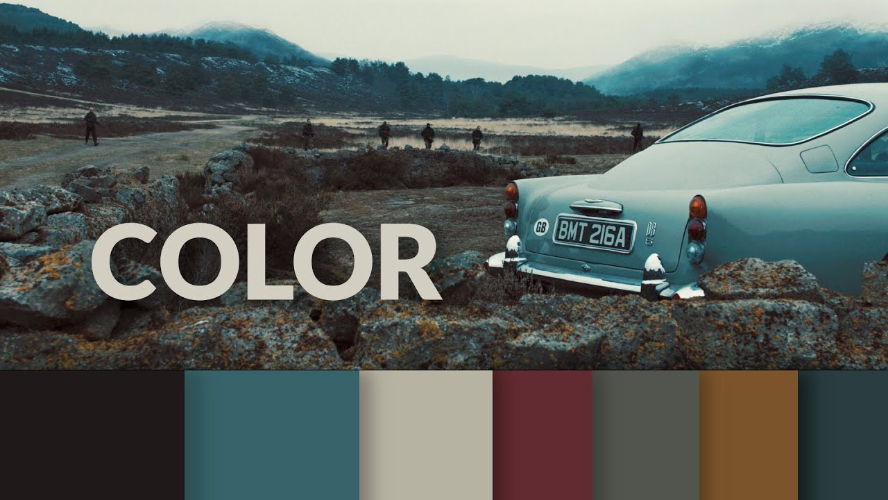
This is another orange and teal look except it's a "cooler" version meaning the temperature is coneys is cooler. This can be achieved by adding a blue tint so it bumps past your oranges a little more without completely overpowering the shot. Notice how the orange on the rocks is still noticeable. This also shows how color grades are never the same and they vary from film maker to film maker and shot to shot.
Here are some more examples of what different color grades look like on the same shot.


High Contrast is really important when trying to make footage look cinematic. You never see washed out, low contrast shots in film because it just doesn't look good. No, there is always high contrast that is balanced to make sure the blacks look black and the whites look white. Another way of creating contrast is using complimentary colors, colors that are opposite on the color wheel, in your shadows and highlights. Complimentary colors naturally contrast themselves and is one of the reasons the "Orange and Teal Look" is so popular.
I have already done a blog post on the steps in color grading and color correction so I won't go into that again, but for my interview with Jack I plan to use the "Orange and Teal Look" because I think it gives a cinematic look while also creating a fun atmosphere with vibrant colors and if I wear to paint Jack I would use lots of color because he has a colorful personality.
Worklog:
Monday- Absent
Tuesday-Presentations and notes.
Wednesday-Presentations and notes.
Thursday-Presentations and notes.
Friday-Presented my MP3 project, presentations and notes
No comments:
Post a Comment